Agency Website Design: How to Create a Website That Wins Clients Before You Even Tell Them a Thing
Discover how smart agency website design turns visitors into paying clients. This guide covers high-converting layouts, trust-building elements, portfolio strategy, and clean UX, plus practical SEO tips for agencies. Learn the key features, common mistakes to avoid, and a pre-launch checklist to help your site attract better leads.
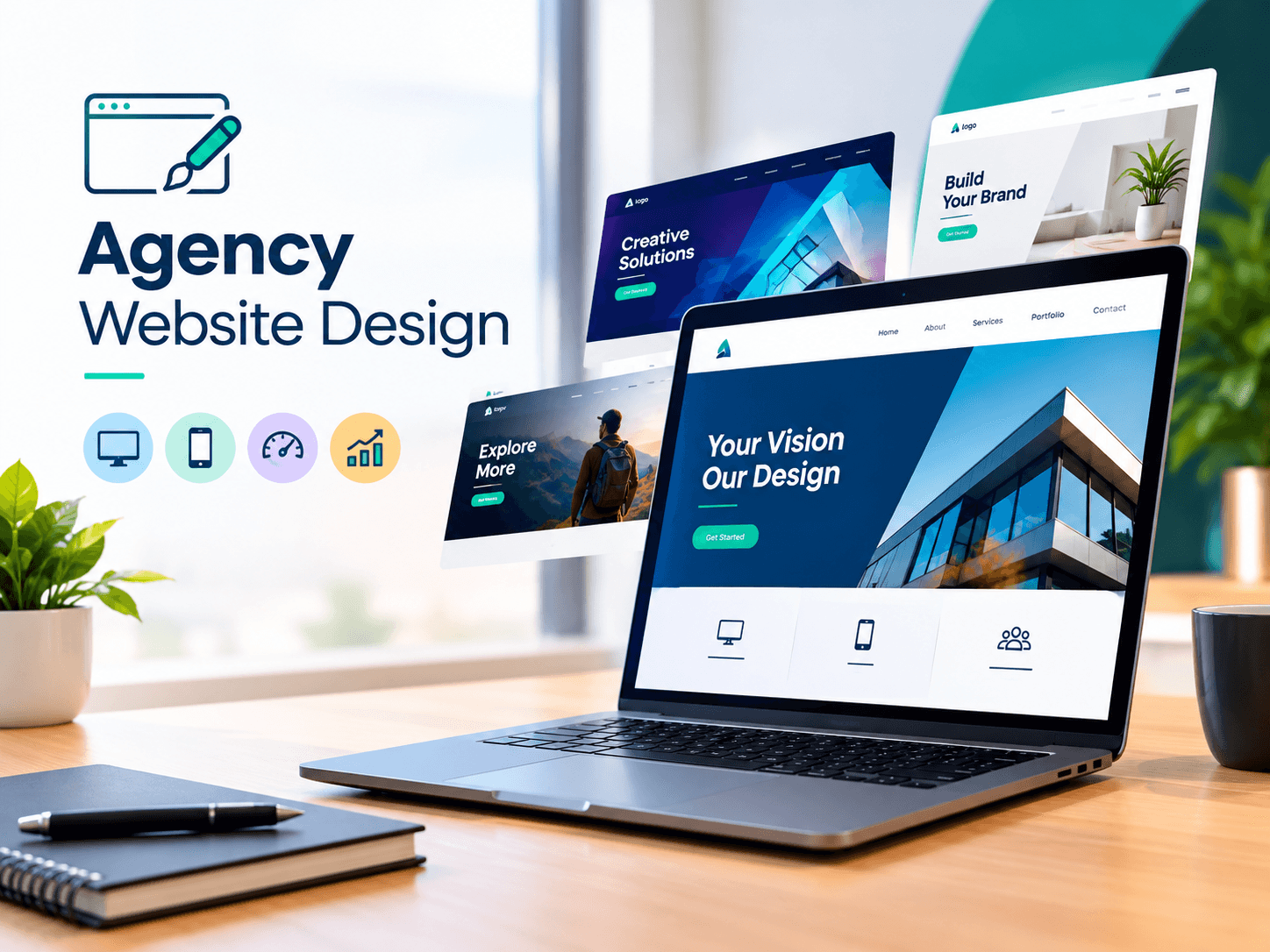
Your website is your chance to close the deal before the potential customer has the opportunity to get in touch with you. Before you fill the contact form, before you arrange a phone call to explain your services and demonstrate the portfolio you have created, and before you show them your case studies, they've already made a decision about the company. They make their decision based on the information they've seen and how your site influences them and only have the time to decide.
This can be a problem for agencies. You must show the innovative and strategic aspect of your company. If your website appears similar to what it was just a few years ago or takes a long time to load or is confusing and confusing, that's your message to potential clients. Nobody wants to deal with a plumber who has leaky faucets.
Let's look at what a high-quality agency websites look like in 2026, as well as how to make use of your website to promote you.
Why You Should Treat Your Agency Website Like Your Best Employee
Your website is available all day long and doesn't complain. It can handle all important conversations that you need at the earliest morning hours. It communicates your beliefs, values and advantages to prospective customers, and assists in screening for high-quality leads. It's your most valuable employee.
However, many agencies have their own websites become an afterthought. They leave their greatest work and imagination for their clients, and leave the "cobbler's children with no shoes" issue to be a secondary concern. What does the end result look like? A website that states "we're not enough busy" to think about ourselves" "...and nobody would like their paying customer to realize that.
A successful website of an excellent agency should not be designed in a way that appears "off." Rather, it must be a style that is functional and focuses on the user's intuitiveness, and when executed well, users are likely to enjoy the website.
Modern Design Trends That Actually Matter
The latest trends will come and come and go. The same goes for "design attractions." To focus on these things can lead towards a dated look. There are however some current trends that you must be aware of due to their alignment with the internet as a majority of people are drawn to on it.
Bold Simplicity Over Cluttered Everything
Websites for agencies of the present take advantage of space instead of the old-fashioned method of placing more information above the fold as you could. The clean layout and the wide space are a current design trend that helps visitors concentrate.
Simple is the key to confidence. For potential clients, removing the information that is competing sends an impression of aware of your identity and the things you're all about. There's no need to be loud to make your work speak about its own.
Motion With Meaning
Website designers have discovered ways to incorporate the micro-animation into their design. For instance, a page may scroll to the right while the headline on a website fades out. The designs offer a simple and customized way to offer interaction for the user.
The most important word is subdued. Animations should aid the user and focus their attention. Animations that delay the loading time of a website or appear to be purely for beautiful visuals, ought to be avoided. The main goal should be to achieve a quality over flash designs.
Typography As A Design Statement
Designs that employ big and bold fonts are not just just an experiment. Many agencies are now using this design element to convey their personal style by their font selections.
Typography can create the mood of a design before design elements are fully understood. Design that is bold must always use fonts that can be read.
Dark Mode And Rich Color
Designs that employ dark modes depend heavily on colors that call to action to make the design make an impact. Designs that use dark tones can look more sophisticated depending on how the colors and tone of the images blend.
User experience can be described as the intangible driving force behind any great website.
An attractive design to look at but fails to function is a mistake. What is the User Experience (UX) can be described as the distinction between a design which is loved by the user, and one that can lose the user within three seconds.
Design for Clarity
Links should be easy to understand. Simple phrases such as "Services" or "Work" are all you require. Complicated naming conventions detract potential clients. Labels such as "The Lab" are examples of naming ideas that cause users to think more than they need to.
A good rule of thumb to follow is that the user must be able to find the content they're searching for within 2 clickings or less. If this isn't the situation the site is too difficult.
Slow Sites Lose Users
There is no need to wait for a site to load slow no more. Websites that take too long to load are not noticed by those who leave the site. Each second that you're slow to load your website visitors are leaving and your rankings on search engines could suffer. Select a hosting provider that will ensure your website is fast.
Check your site, not just at work, but also with slow connections because your potential customers might be viewing your page due to slow points on their connections.
Design using Visual Hierarchy
The most crucial element that can guide readers through the information in the right order is size and the color. The information that supports the content as well as additional actions should be softer. Every aspect on screen should be organized, or else there will be no evident.
For Agencies
Conversion is what really matters. The CRO (Conversion Rate Optimization) is a way to integrate your design and company's needs. Agencies have to think about this in a more specific way than everyone else.
Prioritize Your Most Valuable Action
What do you wish prospective prospects to take action on? The goal of the majority of companies is to encourage prospective customers to contact them or make an inquiry. Each website should guide prospective customers down a simple route to take. Your call to action at the beginning of your page in a place that lets users are aware of the next steps.
Simple calls to action such as, "Learn more," do not really help much. It is important to make targeted calls of action which offer prospective customers something of value. "Book your free strategy call" provides your customers with incentives and explains what they'll be doing.
Lead Potential Customers Step by Step
Every page on your website should be able to lead users to conversion. Each form field is a reason that a visitor will leave the procedure. If you're asked to fill out the name of the person and email address to contact you then you don't require much more than this.
Make as few clicks and few decisions between the user and the end goal as you can.
Describe the Problem You Solve
Your potential customers won't require your assistance because they are looking for "brand strategy," or "performance marketing." They may have an idea as to what's wrong with their sales or are concerned about how their competition is gaining ground. Provide your services with outcomes and the pain your customers may experience. When potential customers are able to see an issue and the solution is described in detail trust is created and they are more likely to become converts.
Test, Learn, Repeat
Continuously thinking about CRO is essential. Simple changes to anything (a headline button, a headline or an sequence of sections) can alter a significant amount. You must view your site in this manner consider it as a an ongoing project and test it regularly. Data is the main factor in determining opinions each time.
Showcasing Your Portfolio The Right Way
A portfolio is the highlight of the website. Making your portfolio look like an appealing gallery is a major error. The design of your portfolio should be carried out as the persuasion tool.
Show Results (Not Just Pretty Pictures)
Making a website and then taking screenshots of it is nice, however, screenshots that say "increased qualified leads by 140% in 4 months" is a great way to demonstrate. The customers aren't looking for the aesthetics of your design They want results.
Tell The Story Behind Each Project
A successful project will have the beginning, the end with a problem, tension, and an excellent solution. Create your case studies in an approach that allows you to can capture the juice.
Case studies that are well-written are able to capture the imagination of a prospective customer and allows them to visualize themselves as the client. This is an important factor when it comes to closing an agreement.
Curate Ruthlessly
The mere fact that you have more does not necessarily mean that your portfolio is better. Ten amazing, fully documented projects outdo forty thumbnails that have been re-worked. Show potential clients what you'd like to see more of. Present potential clients with budget-friendly work that shows your ability to perform in this area. Your portfolio should demonstrate the direction you're headed instead of where you've been.
Storytelling Through Design
The most effective websites for agencies don't just provide information. They lead the user to an adventure. There is no specific storytelling segment. The process of storytelling is a journey. Think about an emotional trip, an experience when someone is scrolling and engaging with your images. This could reveal the issue that the viewer is confronted with and create a sense of urgency and stakes, explain the agency and provide outcomes to solve the issue. This is similar to how storytelling has been done over thousands of years, and certainly seems to be the way it should be.
Design plays a role in the narrative by the pace. Designs must move along and engage the viewers with enough details. If you do it right, by the conclusion of the narrative the viewer will be prepared to communicate with the designer via their own.
This strategy should be applied in your "About" section. Use clear language to convey what you are trying to say. Do not bore your viewers with the same boring words. Include some soul and emotion to the piece.
Your "About" page deserves special mention here. Potential customers want to know about who is behind the scenes. Avoid the corporate lingo about "passion for excellence." Let them know why you began and what you believe in and the people you enjoy working with. Your personality creates connections and connections build business.
Mobile First Design Prioritizes Abundant Value.
Most of your traffic doesn't reside behind a laptop. If your site's not designed to provide that significance on screens, you're losing customers.
The mixed metaphor of responsive design framework is, more or less, is able to handle different dimensions of screen. This implies clear text clear and large buttons, and overall good pictures. Links and navigation should be able to collapse into items that are clear and usable.
The design of mobile-first, by nature, means that your site will be designed to work with the smallest common denominator among the devices on which users are likely to access your website. This, in turn, means your website and information will be displayed in the best way at first, and later it will be made available in a variety of ways, with more styles as screens and interface devices expand in capabilities. It is usually unsatisfactory and reflects the gruelling design of desktops on phones.
Your mobile users will be on the move at various moments, and will look through your website with different levels of attention. You must ensure that your site is accessible and that extracting value is made as easy as is possible.
Building Trust By Leveraging Social Proof
The majority of people trust other's judgment over your own. This is the place where social evidence is crucial.
Testimonials That Speak For Themselves
The most persuasive testimonials have the greatest weight. "Great to work for" is a general negative statement. Testimonials that highlight an issue in particular, relate what happened, then finish with clear results for the business are highly effective. In addition, they should include the names of the company and their name.
Forwardload your testimonials by including the photo of your client in the event that you have it the more testimonials you have, the more trustworthy you will appear Beware of vague, unspecific praise since it's perceived to be fake.
Proof Points
Certain logos are instantly recognizable however, even the unrecognizable logos have examples. Industry awards are proof of their worth. The facts about your record can ease the concerns of your clients. Awards-winning agencies usually hide them data, but they shouldn't. Instead, make sure you make sure to share your hard data all over your site.
Real Talk
Asking a customer to speak about their experience and your company via video is also beneficial. Why? Because people trust and appreciate authentic testimonials from real people. Many agencies do not accomplish this and leave an untapped gap that you could take advantage of.
It's the Little Things...
The most effective websites for agencies result from the countless small elements connected. A simple design, concise user flows through the website, a rich collection of portfolios, as well as the ability to work equally on desktop as well as mobile devices. The most important thing is the trust that comes from references to clients.
You Get One Chance
Your website is your first impression, and the most important factor for a salesperson. It's also your most important sign of credibility. Think of it as the most important client project, as that's exactly what it is.
Develop your portfolio and lazy calls to action and testimonials in one go in order to create a better website in pieces. At the end of the day you'll be able to create a site of high-quality that customers prefer over one that appears nice.